Year: 2018
Roles: Brand Designer, Packaging Designer, Project Manager
roles: brand designer
project manager
Location: LATAM and EU
Colaborator: Elbert Merlin
How can we rethink a company’s branding strategy
to enable growth through a strong visual language in the global market?
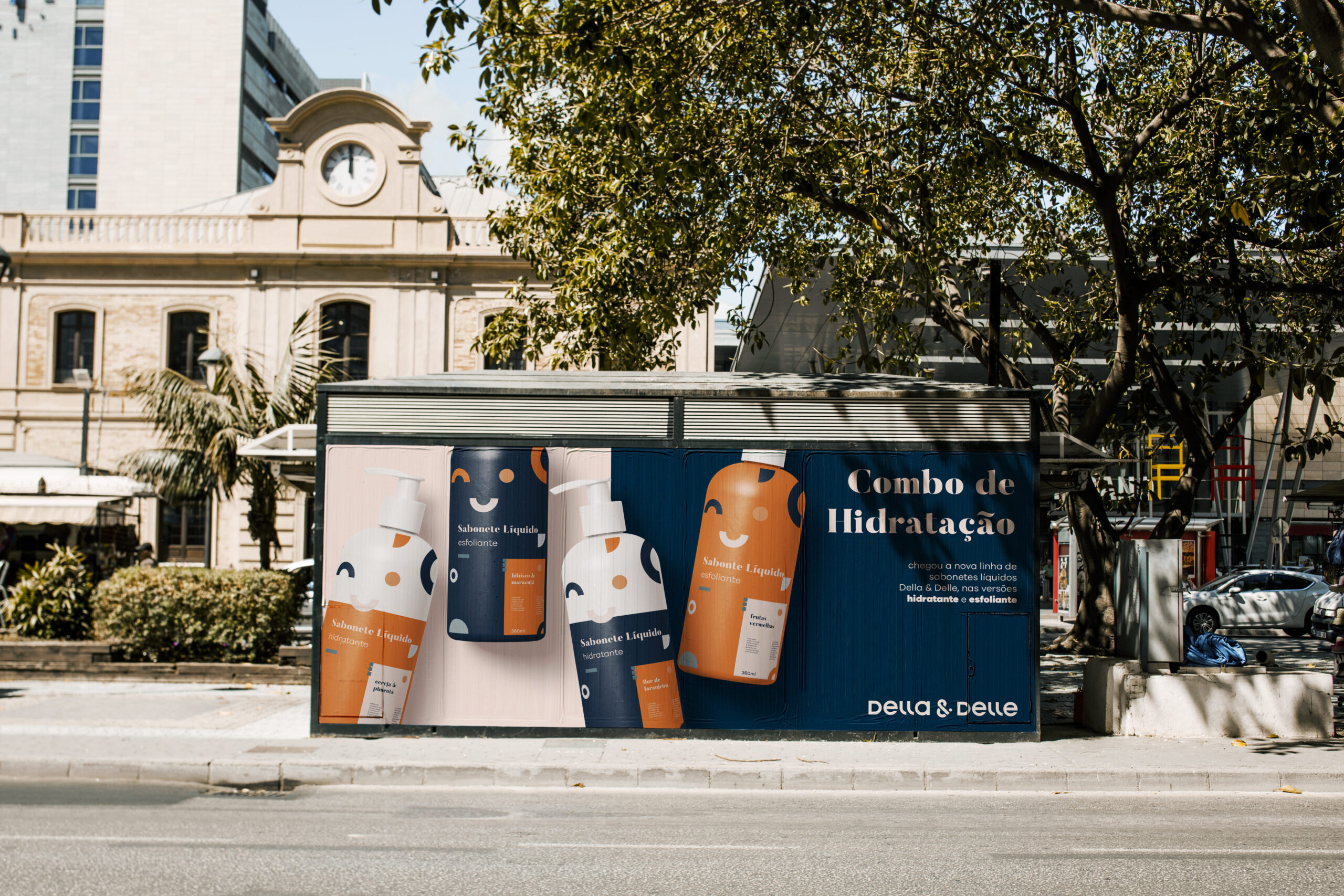
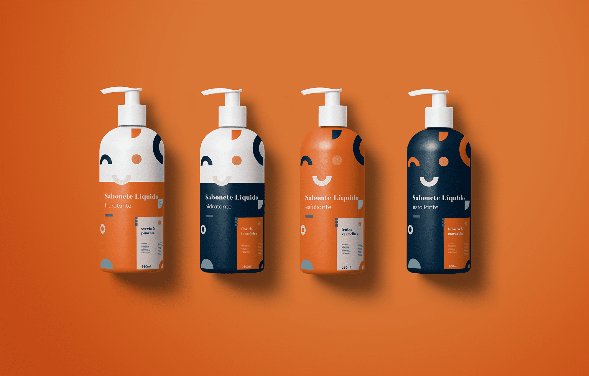
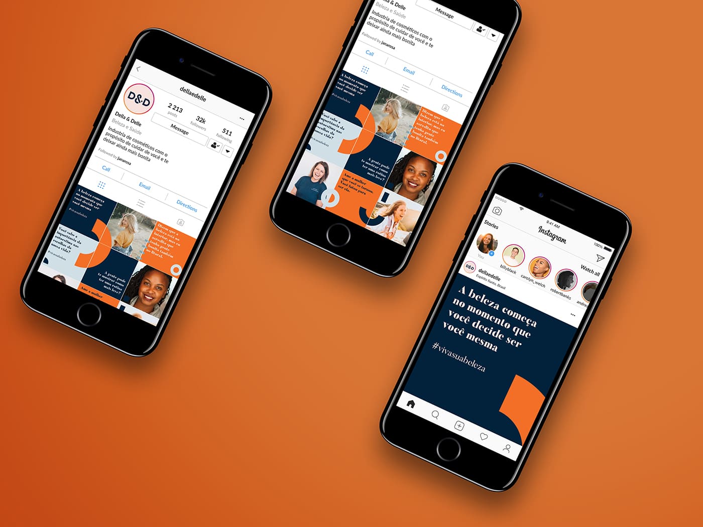
Della & Delle is a cosmetics company who believes beauty must be attainable and accessible to everyone. As a company with extensive experience in the Brazilian beauty market, their main product being a henna eyebrow tint, they saw the need to rethink their branding strategy for a more global audience highlighting consumer beauty professionals in South America and Europe.
During the brand analysis process, we perceived that the biggest challenge was to rethink their brand positioning so that it maintained appeal to beauty professionals. Simultaneously, we needed to design a visual language able to communicate to the domestic market.
–
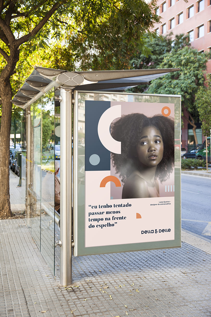
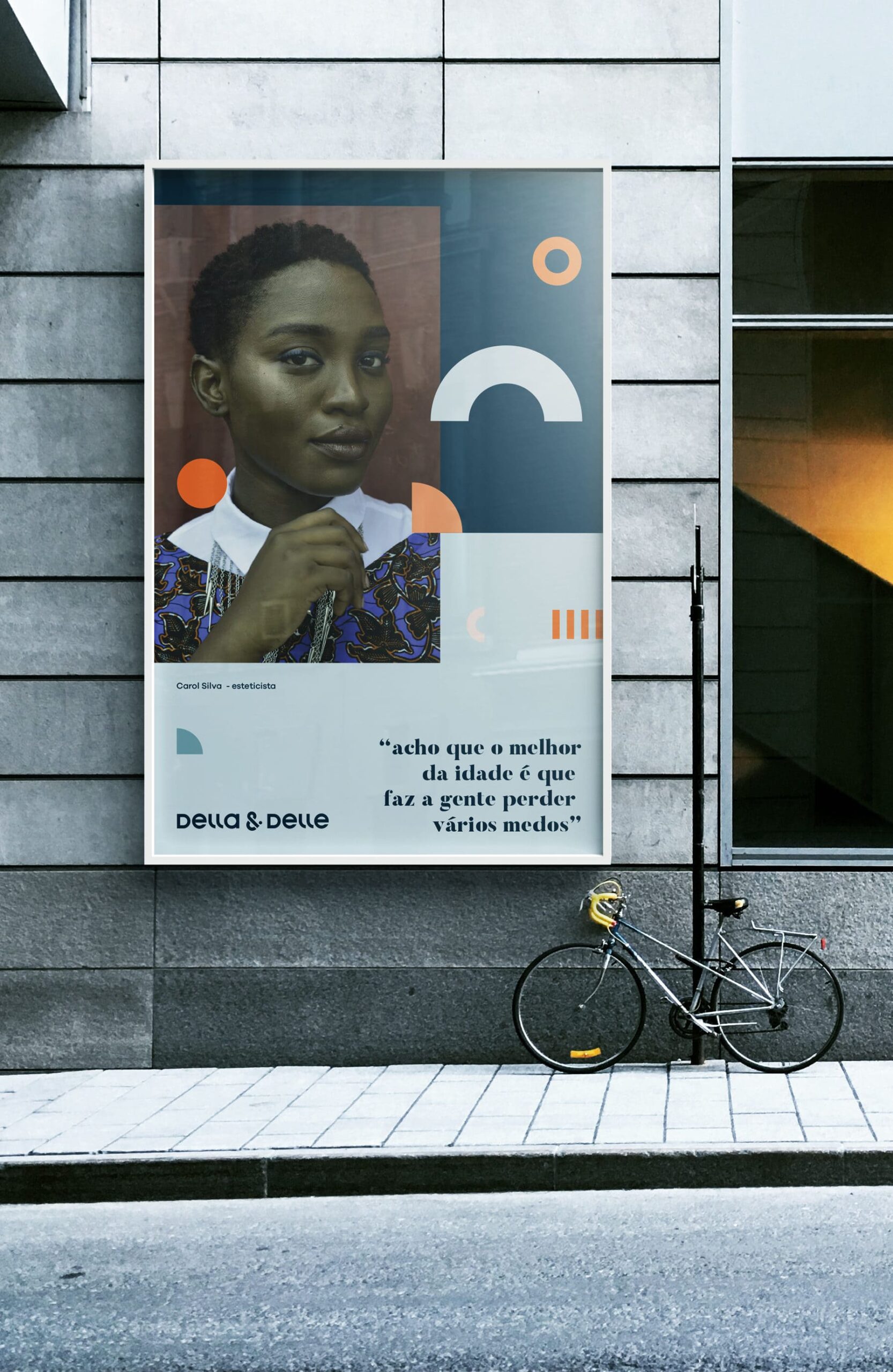
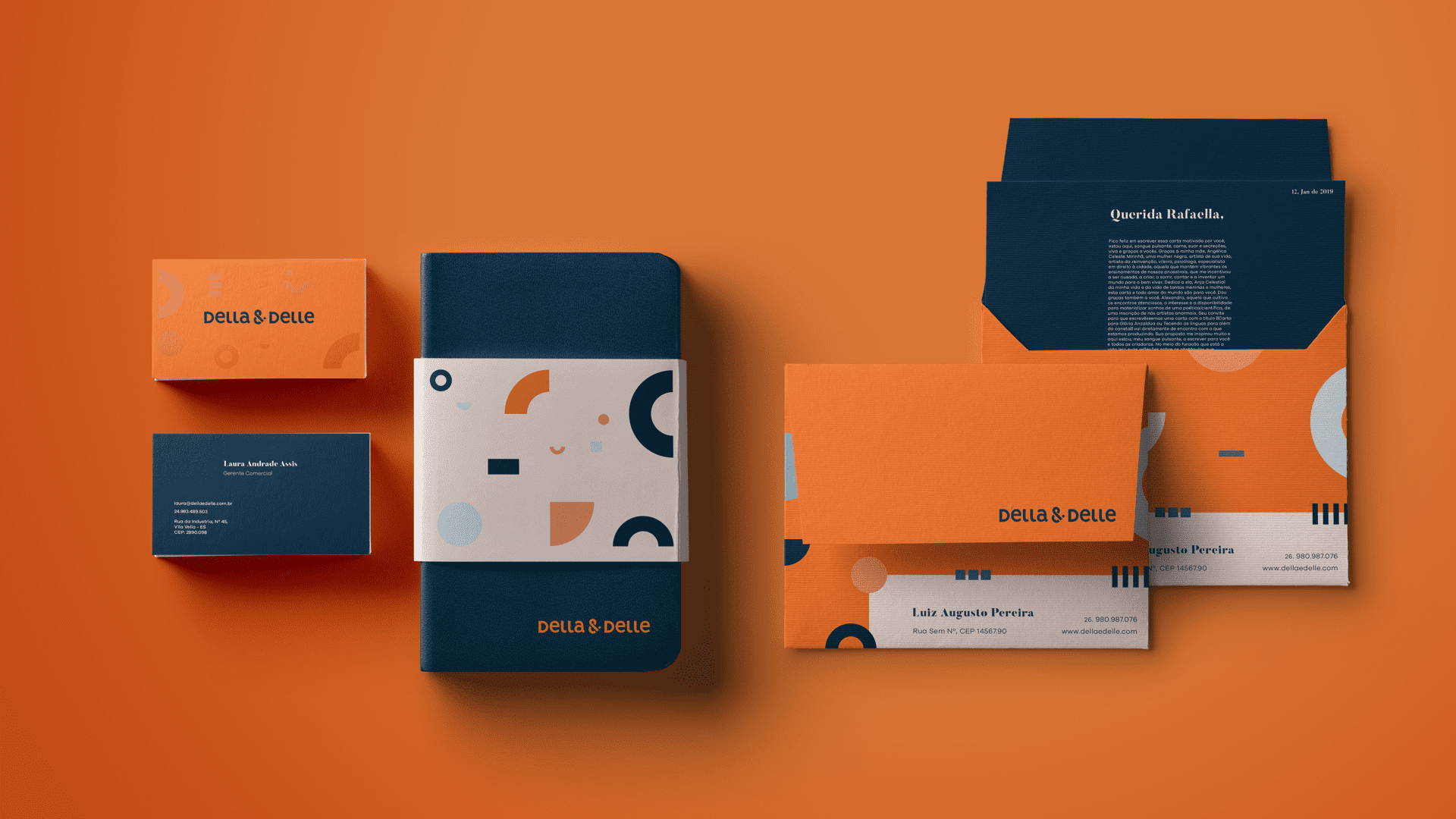
Color palete
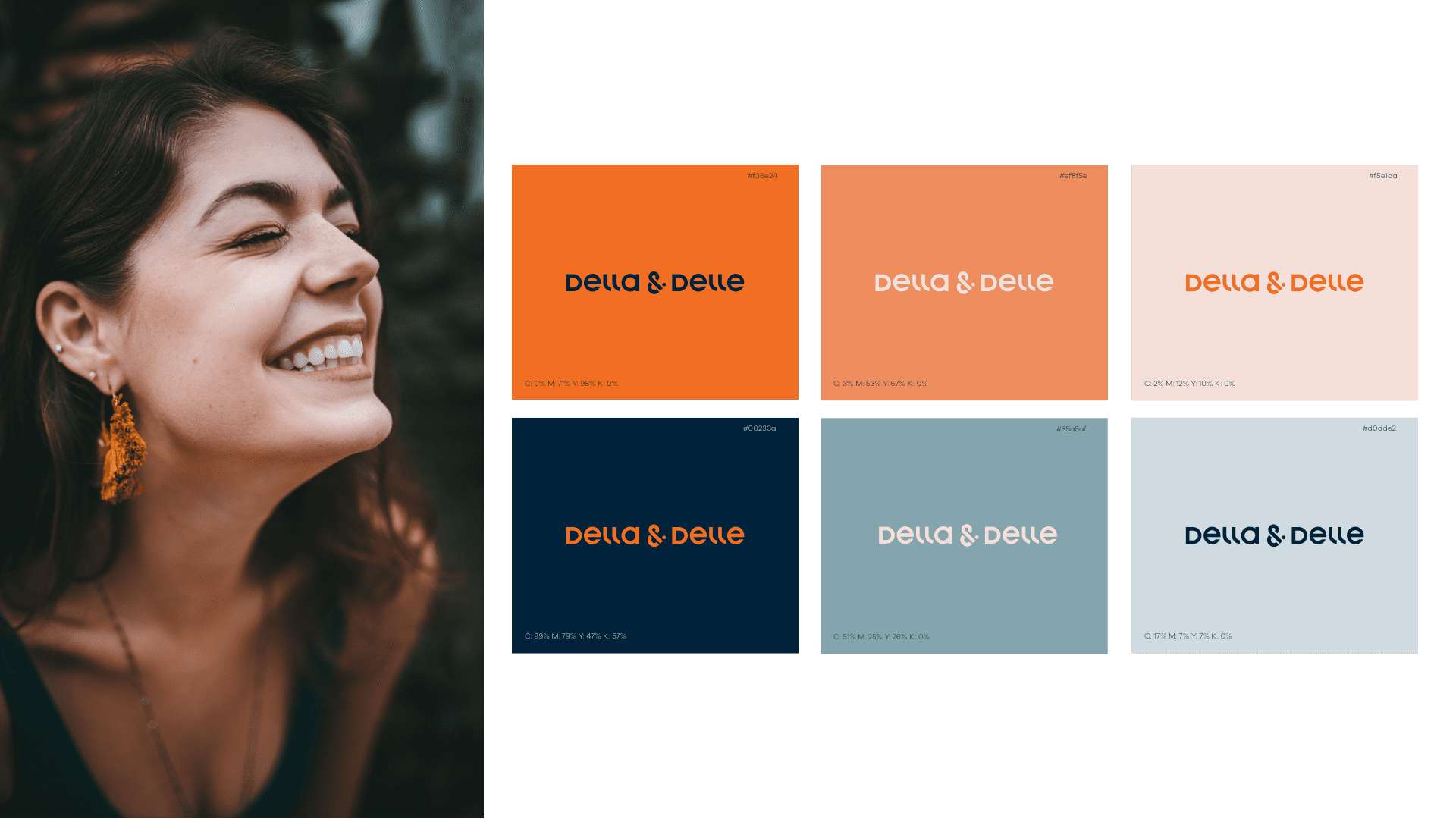
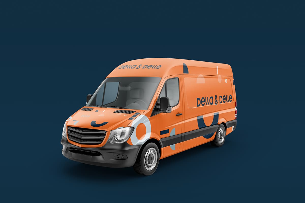
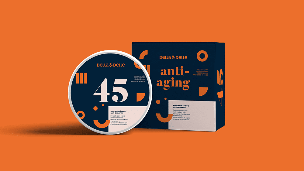
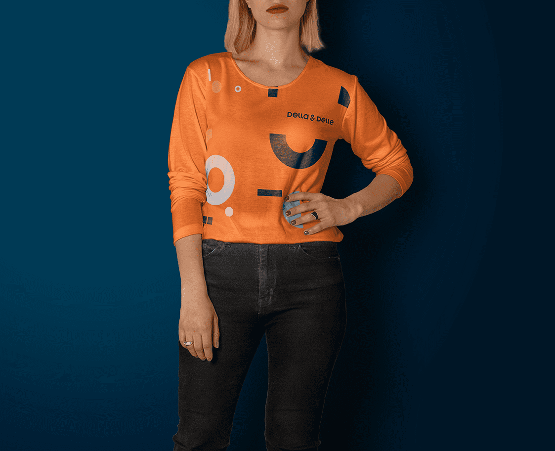
This project had one restriction as a designer: the client wanted to keep orange as their institutional color as it had great reception during user tests and consumer feedback. We levered the vibrancy and energic youthfulness of orange to enable us to work with contrasts: blue. We created balance by creating less contrasting shades of both colors. Another crucial point in the color choice was that they are fundamental tools in the differentiation between the visual language targeting the professional and the domestic public.
–
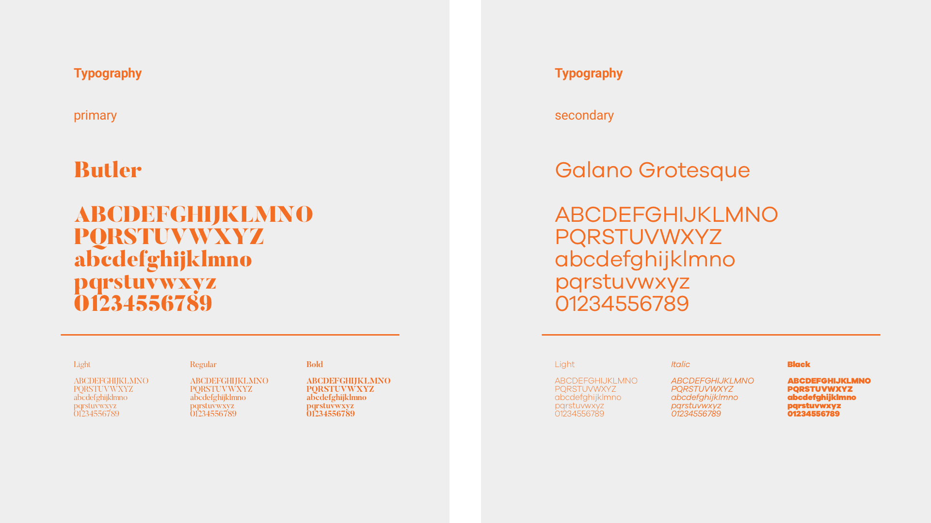
Typography
The usage of type was based on the junction of a contemporary serif font and a modern grotesque. This created a stylistic contrast while offering legibility to long texts, making reading easier in digital media.
–
Identity system
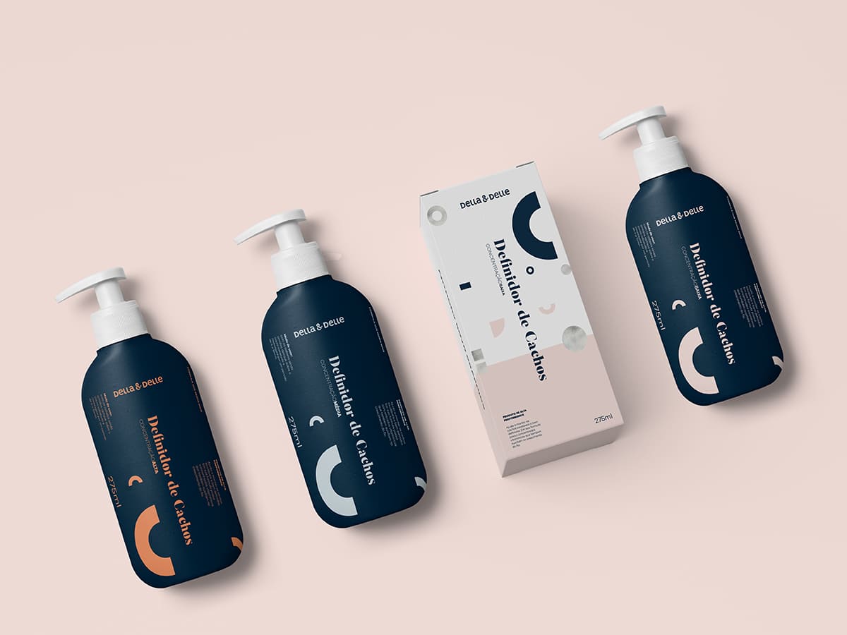
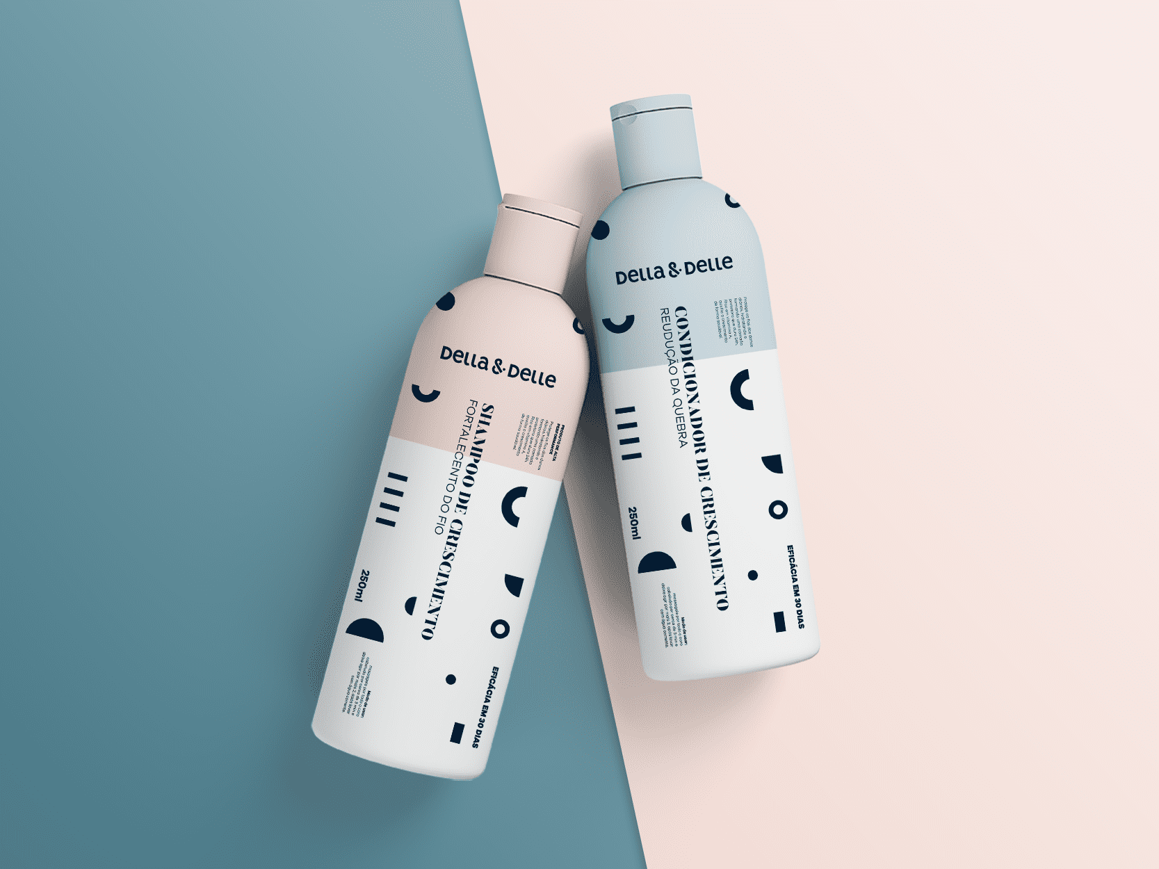
Being a brand within the Magician's archetype, Della & Delle seeks to create magical moments—experiences rare, exciting and special—to customers. Della & Delle helps people to transform themselves. From field research with professionals and individuals that make use of Della & Delle, the concept we developed for the visual identity system was based on the relation of the beauty industry professionals with the symmetry, as well as the self-esteem transformation that the brand provides to its customers. In this way it was thought of a geometric grid that allows the unfolding of numerous graphical forms, which make up a visual language of transformation, expertise, and precision. This system also aided in the development of the logo.
–
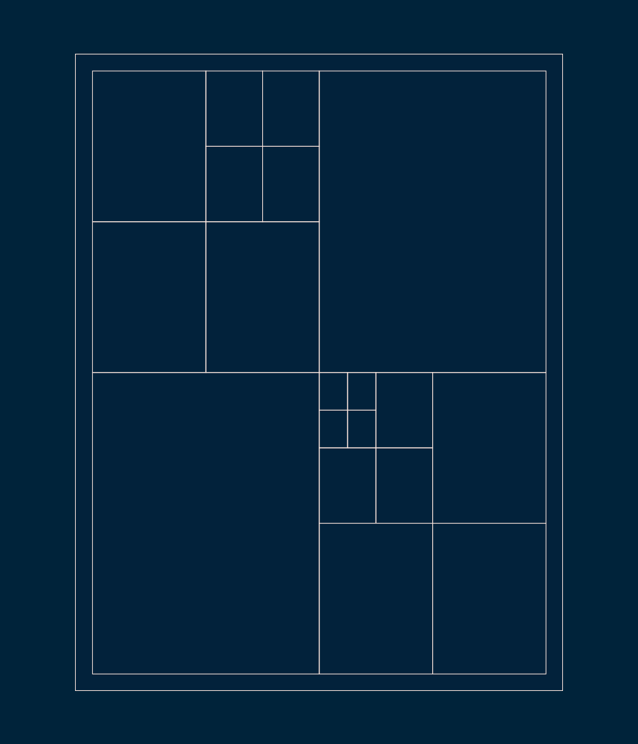
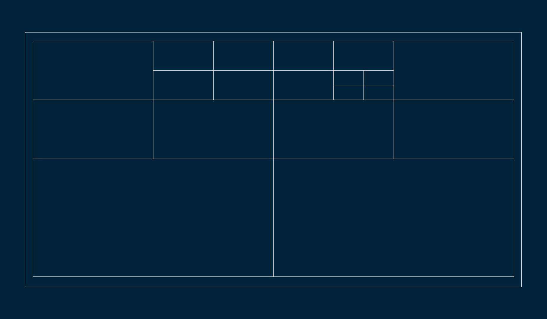
Layout grid
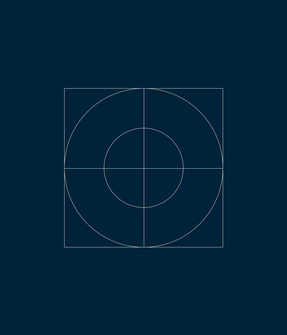
In order to maintain consistency throughout the project, a grid for layouts was thought up that allowed for application in all kinds of support and framing. From the concept of square roots, an infinite division based on multiples of four allowed for the correct application of the visual identity forms, images, and text.
The lighter colors, combined with the use of negative space and application of special colors like metallic printing, allowed the brand to create a language for its premium products seeking to communicate more directly to professionals in the beauty industry. The packaging also worked with a medicine package" concept where we used typography and information architecture to facilitate access to relevant information such as composition and how to apply.